On this page
Who is affected
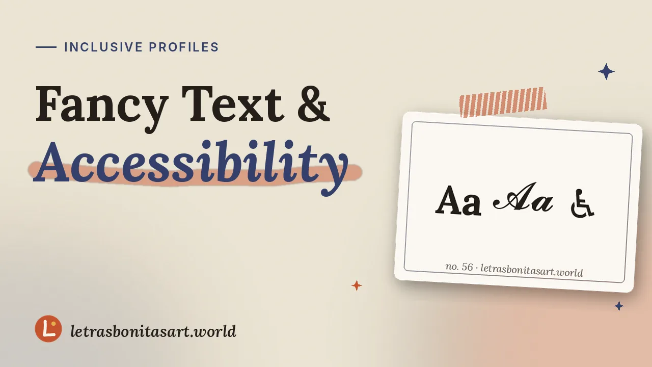
People who are blind or have low vision use screen readers, like VoiceOver on Apple devices and TalkBack on Android, that read the screen aloud. People with dyslexia and anyone using automatic translation are affected too.
What screen readers do with fancy letters
Because 𝓐 is not the ordinary letter "A", a screen reader may:
| Behavior | What the listener hears |
|---|---|
| Reads the technical name | "mathematical bold script capital A" |
| Skips the character | Silence, as if the word isn't there |
| Spells it out | Separate letters, not a word |
| Reads it correctly | Some newer systems normalize certain styles |
It depends on the device and version, so you can't guarantee people will understand.
Six rules for a stylish, inclusive profile
- Keep essential information plain: name, what you do, contact and links.
- Style one word or one line, never the whole text.
- Keep hashtags plain. #𝓪𝓻𝓽 won't show up in searches.
- Put emojis at the end of a sentence, not between words.
- Avoid glitch and upside-down text in messages that must be understood.
- Add alt text to your artwork whenever the platform allows it.
Before and after
| Before | After |
|---|---|
| 𝓜𝓲𝓻𝓪 𝓛𝓾𝓷𝓮 ✧ 𝓲𝓵𝓵𝓾𝓼𝓽𝓻𝓪𝓽𝓸𝓻 ✧ 𝓝𝓨𝓒 | 𝓜𝓲𝓻𝓪 𝓛𝓾𝓷𝓮 ✧ Illustrator in New York |
| 🅕🅞🅛🅛🅞🅦 🅜🅨 🅢🅗🅞🅟 | Prints in my shop ↓ |
| ⓒⓞⓝⓣⓐⓒⓣ: ⓔⓜⓐⓘⓛ | Contact: hello@example.com |
Alt text for your artwork
Alt text describes an image for people who can't see it. Describe what matters: "Watercolor of a fox curled in snow at dusk, soft blue and orange tones." Skip "image of", and keep it to a sentence or two.
Try it yourself
Turn on your phone's screen reader for a few minutes and listen to your bio:
- iPhone: Settings › Accessibility › VoiceOver.
- Android: Settings › Accessibility › TalkBack.
It's the fastest way to understand why less is more. Then come back to the generator and style with balance.
Questions artists ask
Do screen readers read fancy text?
It depends on the device. Many read the character’s technical name or skip it, so keep important information plain.
Does fancy text hurt my reach?
It can in search, because styled letters and plain letters are usually different text to search systems.
Which style is most accessible?
No Unicode style is fully accessible. Style a few words and keep the rest plain.
Founder and editor of Letras Bonitas Art. Builds the tools and writes the guides on this site for artists who letter on screens. How we review our pages.